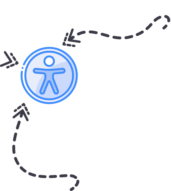
Livsmedelsverket is the state management authority for food issues working actively in consumer interests for safe food, fairness in food handling, good food habits, and legislation on food. The aim of this project was to both update the UI and make sure that the website is accessible for every user. With the web accessibility laws coming in effect on June 2025, Livsmedelsverket like many companies and authorities, have spent resources into making sure that their websites comply with the Web Content Accessibility Guidelines (WCAG).
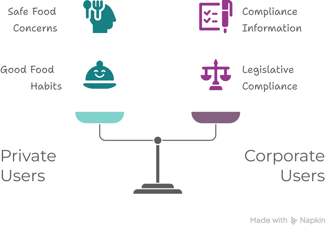
Livsmedelsverket user’s are divided in private users and corporate users. Private users are mostly concerned about safe food, good food habits, and food recalls. The corporate users go in the website to learn, and know how to comply with food legislation in Sweden.
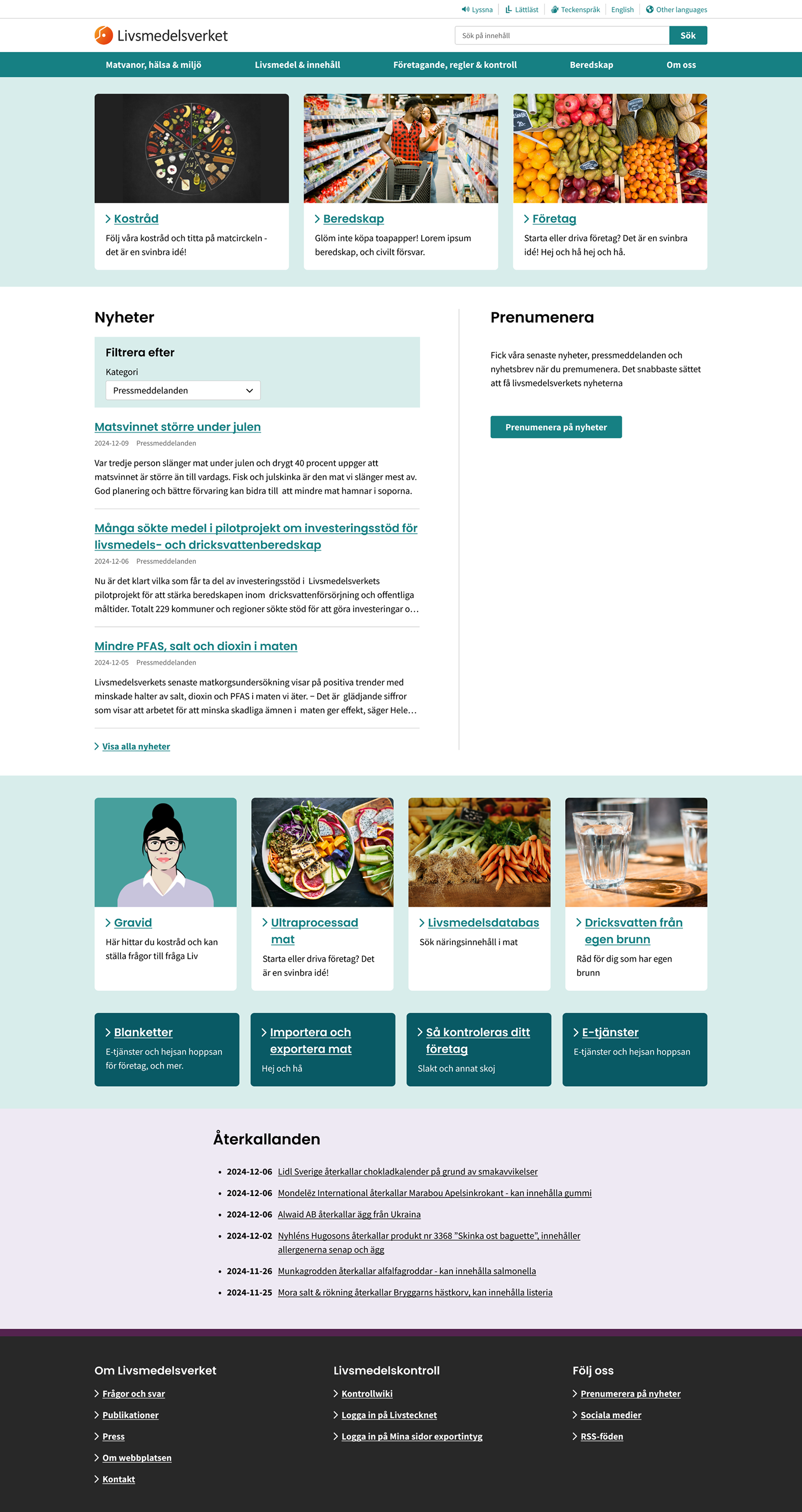
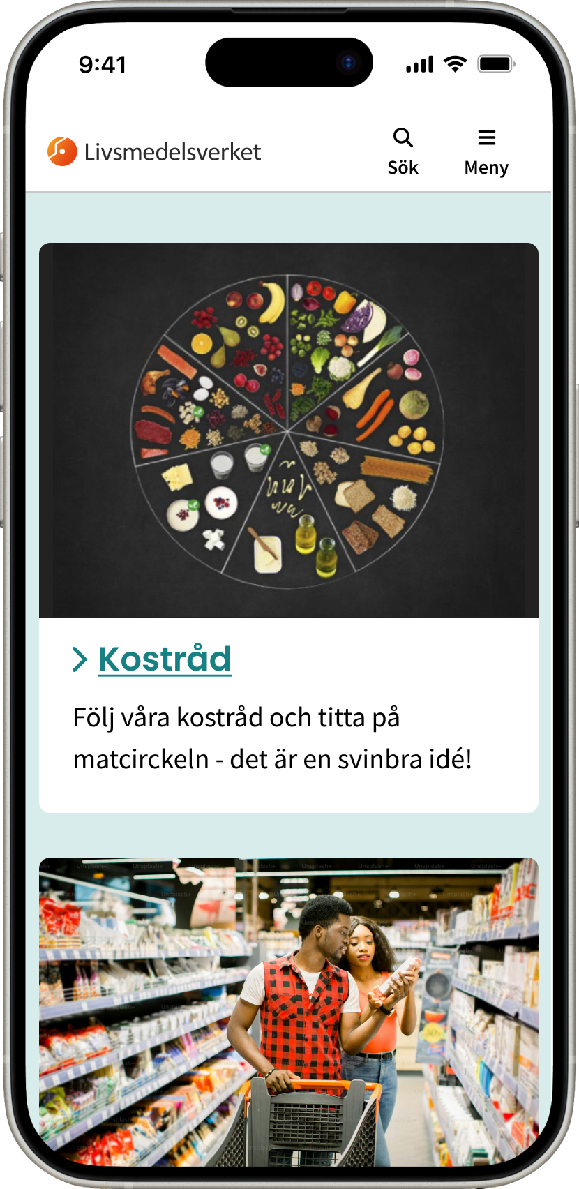
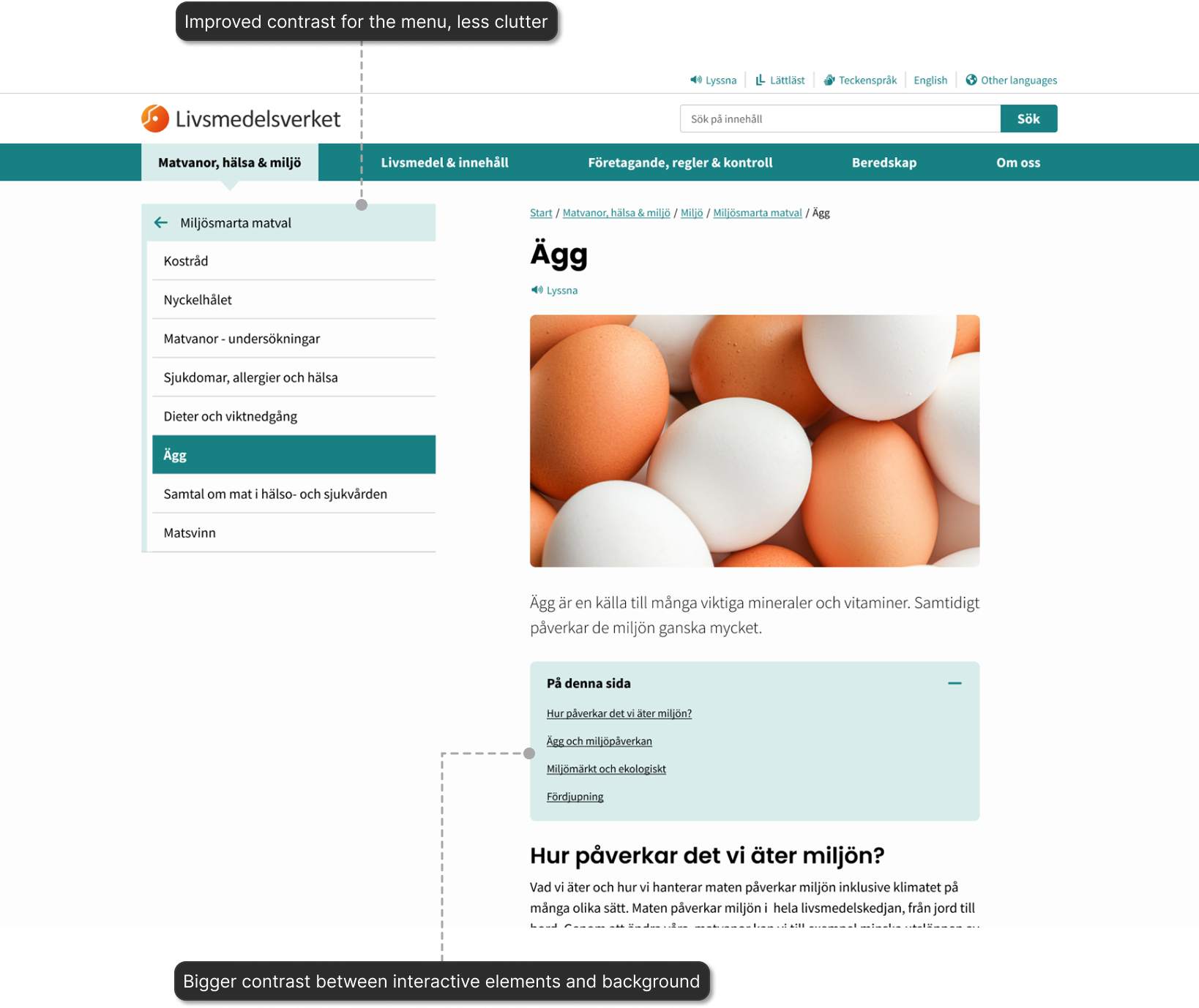
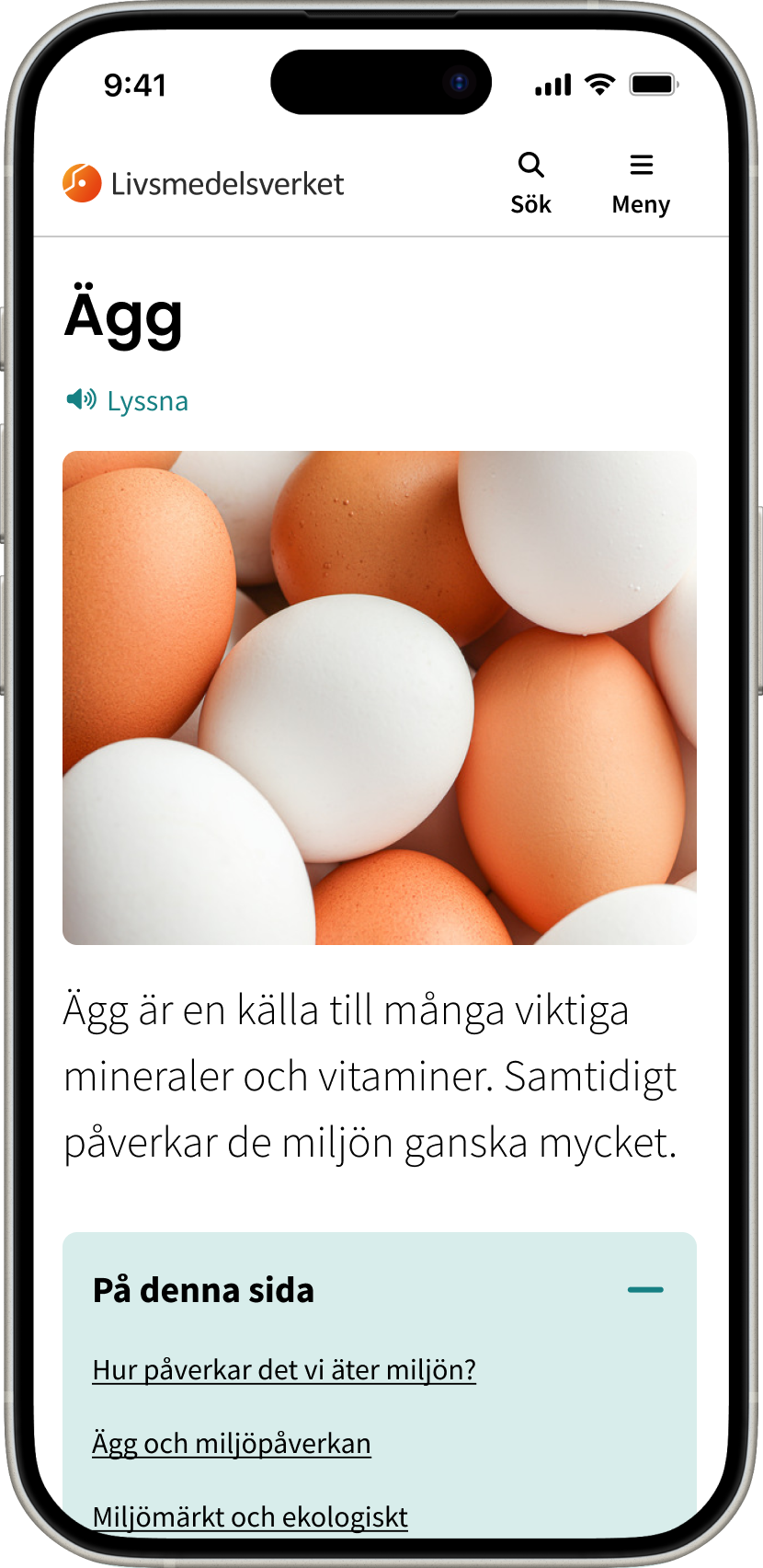
I redesigned the website so it would have a smoother contrast between sections. I unified fonts and the colour palette. I made sure that the UI complied with the WCAG, contrast, sizes, links, etc. The article or content pages were also adapted to accommodate the new accessible line length. Other elements like tables, menus, and teaser were also revised.
Fully remote work and short project. Clear and poignant communication was essential for the project’s success.

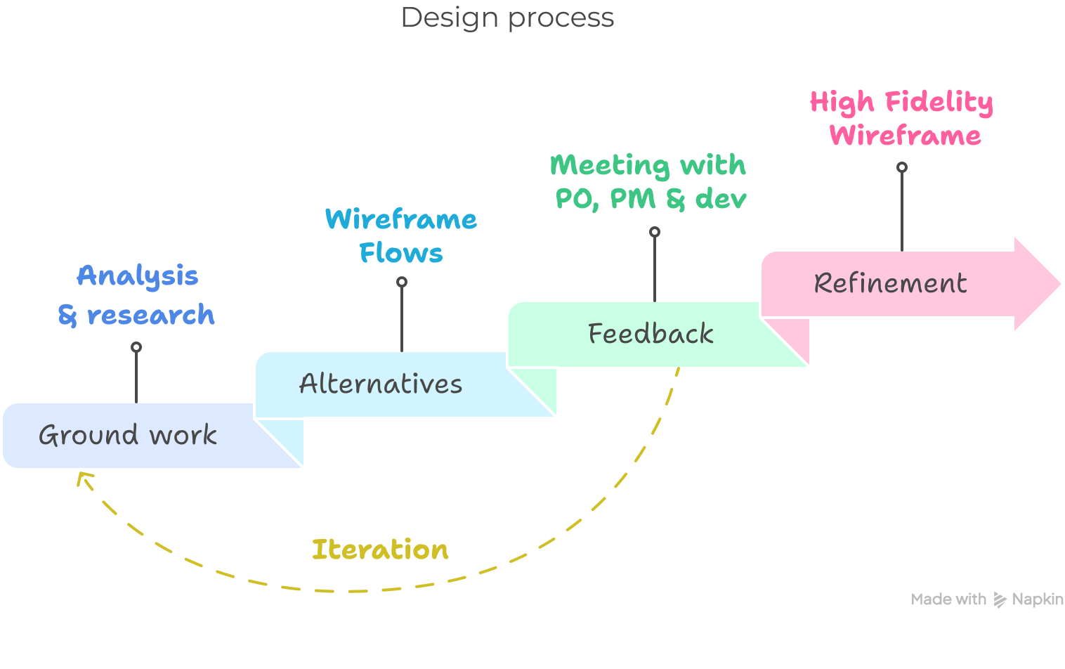
This was a short project, it started with a meeting with the project manager and the tech lead where they explained the context and what had been done so far in the project. After, I had a meeting with the project owners. They explained their objective to comply with the WCAG and to update the UI. They shared a sketch to show what they had in mind for the start page. I used it as an inspiration, and to understand the direction they wanted to take the UI in.
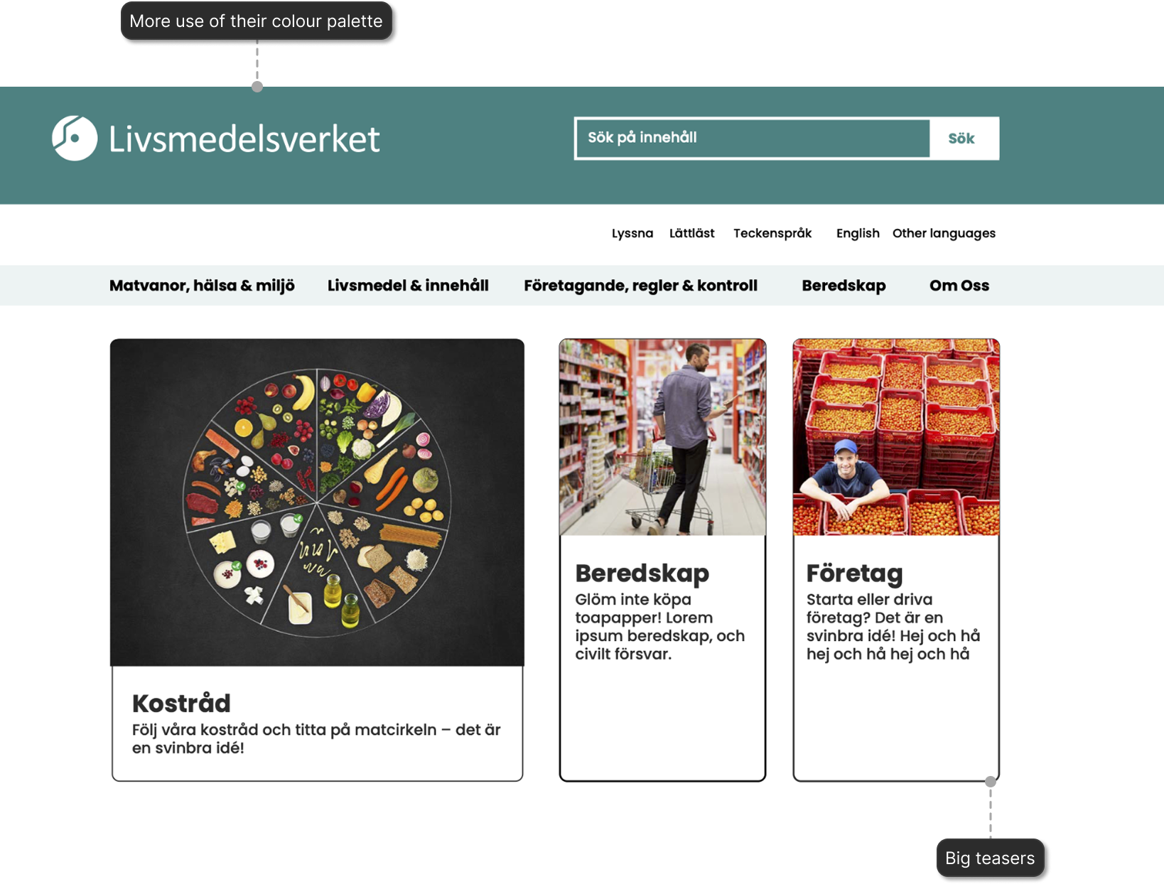
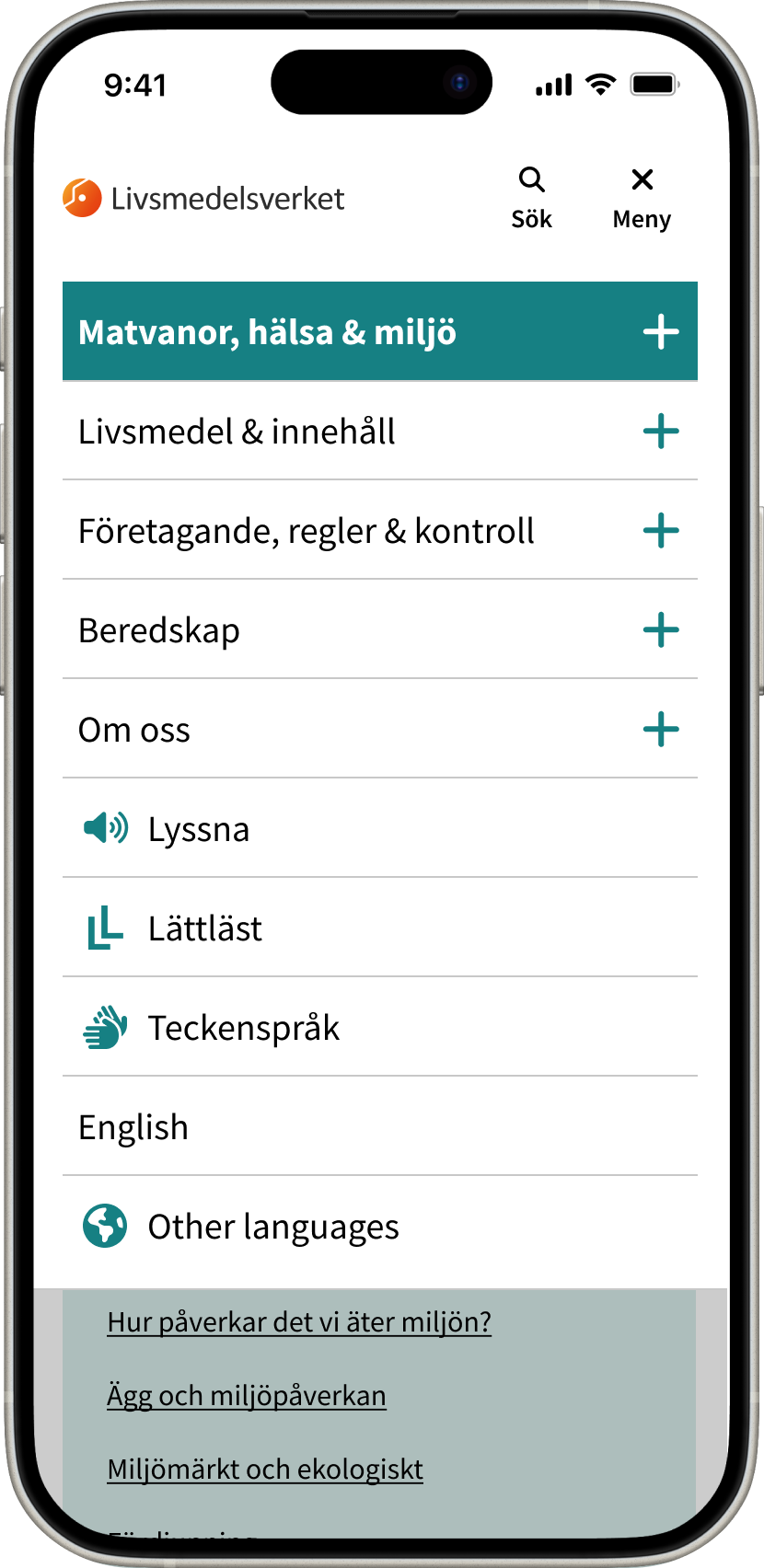
Talking with the fullstack developer, I realise that we needed to consolidate fonts and colour palette. While doing that I made sure that the sizes and contrast were compliant with the WCAG. Other global changes had to be made, specifically to the navigation and to the content pages. The content pages needed changes to the content grid to accommodate the new line length. The navigation got a cleaner look and the secondary colours were used more to make the information hierarchy clearer and to create breaks in the paragraphs so the scanning of information would be easier and faster.
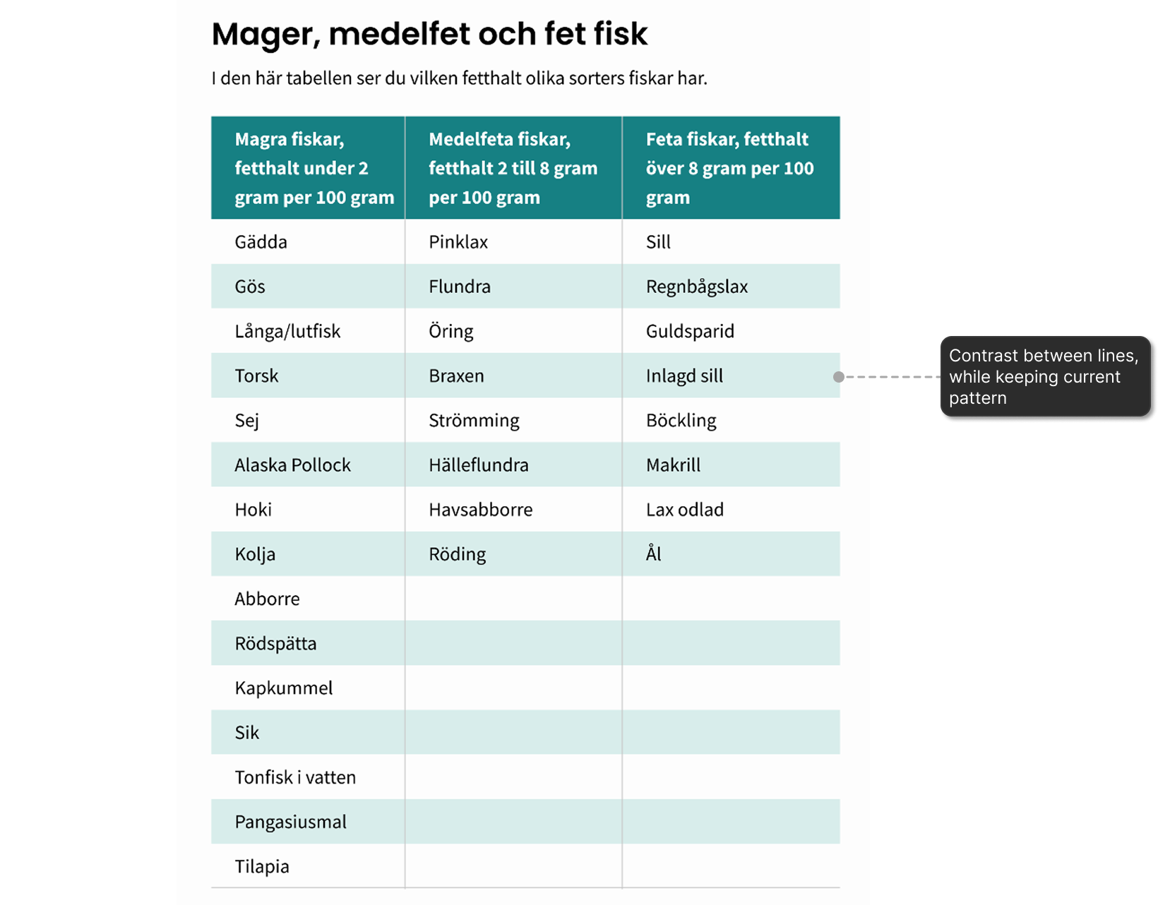
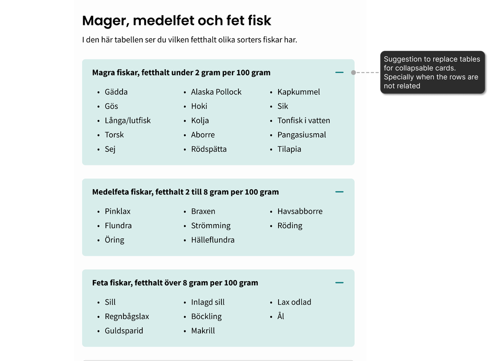
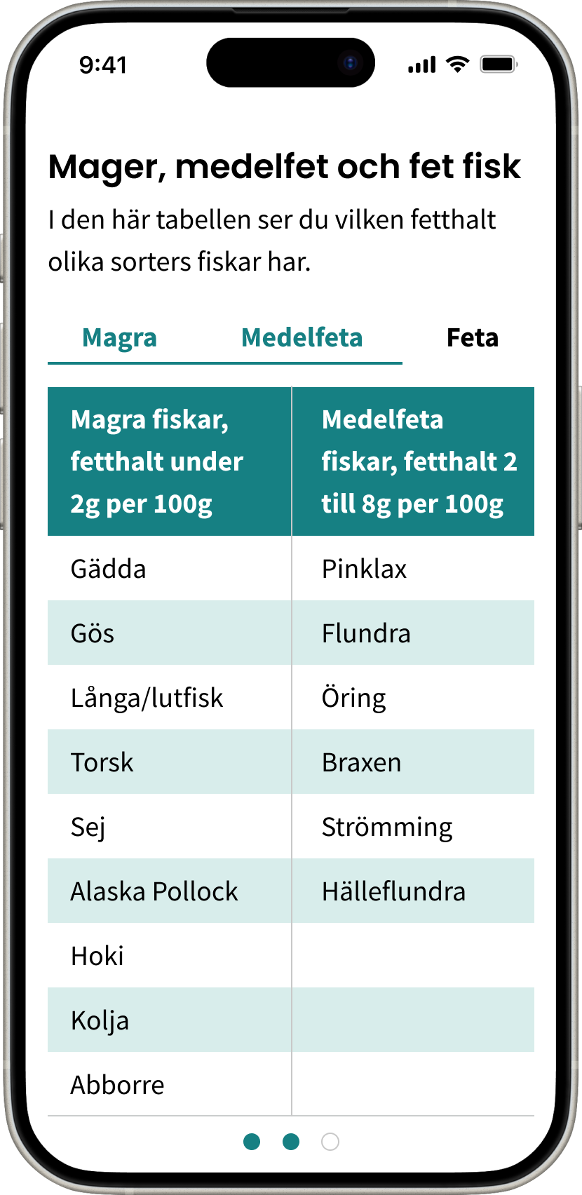
I also gave UX improvement suggestions for other components in the website like the data tables. Tables are often used in the website. I created some alternatives on how to improve their readability and usefulness. There were two main alternatives. The first one, was to add colour for contrast between rows. However keeping the tables as they were came with challenges for small screens. I designed a table that used tabs, so the user would be aware of all the columns at a glance and could change between what they considered the relevant content faster. The second alternative, was to reconsider the use of tables for all the display of data. Specially when the information in the rows wasn't related. For these cases I designed cards to be used instead of tables.
I had weekly meetings with the PO’s so there was constant iteration until only one alternative was left. Once the designs for the different sections were approved I would deliver it to the full stack developer through a meeting and Figma specifications. Who would then implement and sometimes come back to me when questions or concerns arose.
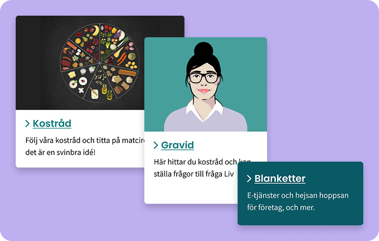
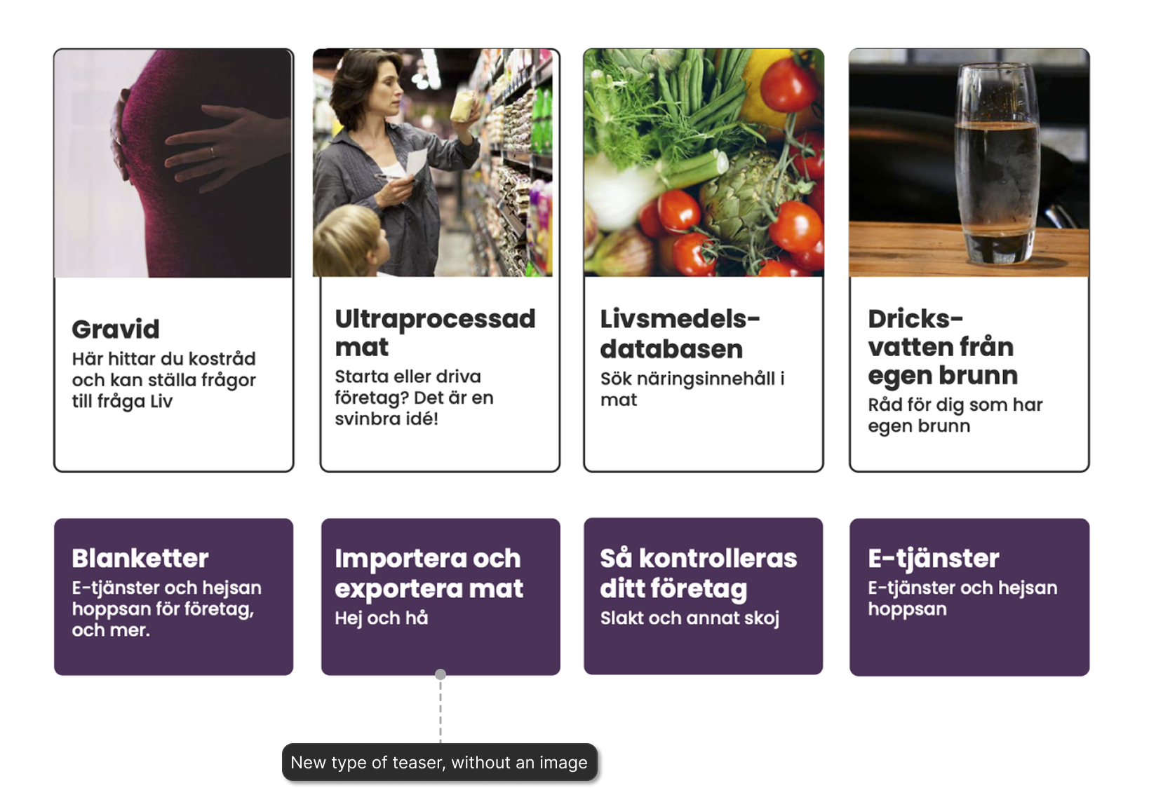
Three different types of teasers, depending on the context and content. They make the website more dynamic.
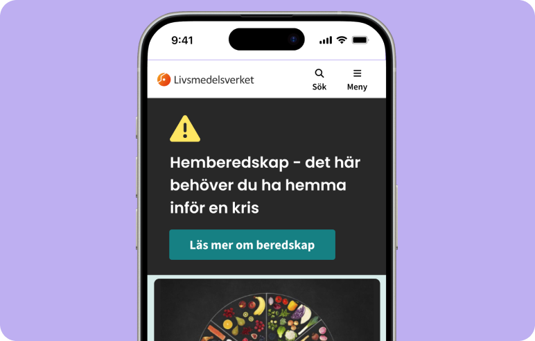
A banner that grabs the attention of the user to warns or makes them aware of important notices.
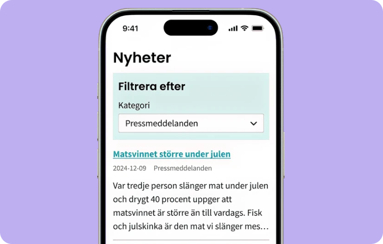
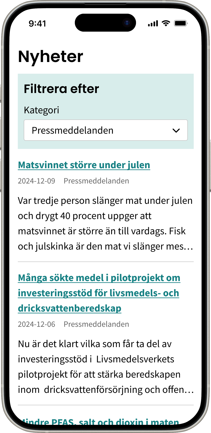
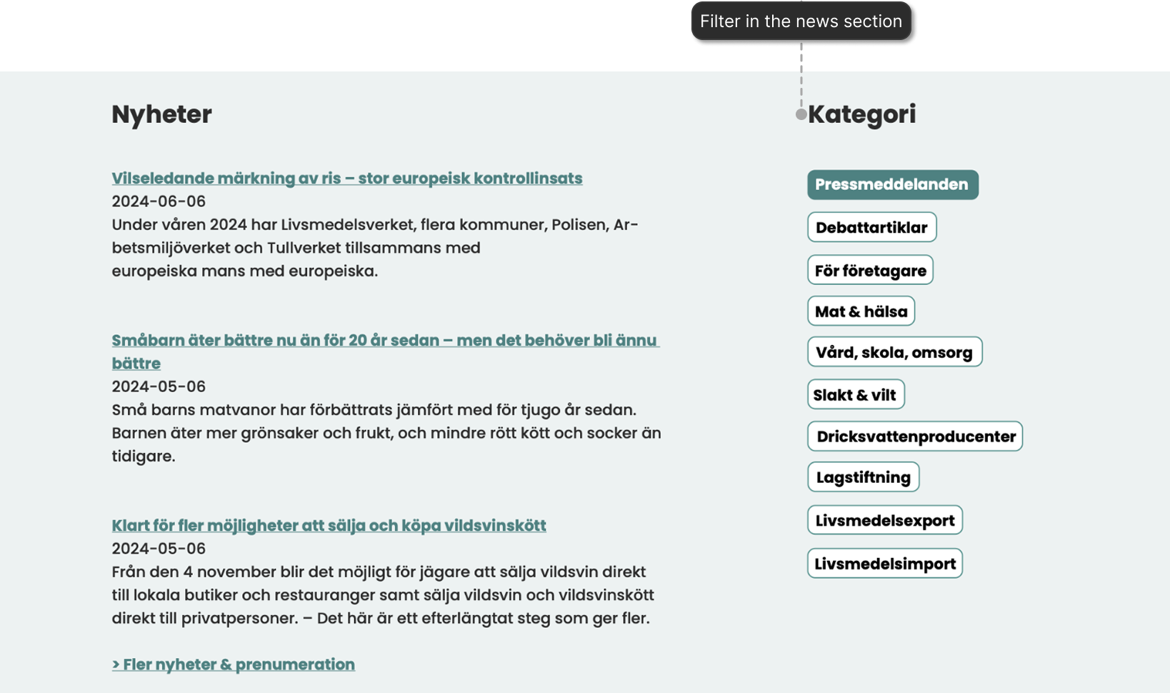
A quick dropdown to filter on the news by category in the front page.
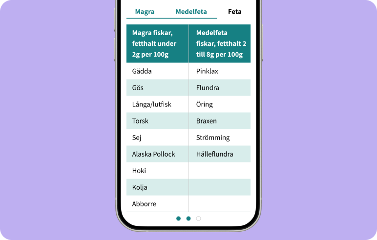
To avoid horizontal scrolling, an alternative with tabs showing all the columns was designed.
Expand on decisions through annotations. I believe the number of meetings during implementation could have been reduced if the designs had more annotations. Specially regarding the decisions directly related to WCAG. So, be more explicit with my annotations within the design and use them to stress the importance of the design decisions made.
Future features and improvements should be documented and delivered to the PO’s, the wireframes, design file, and explanations, so they can consider and plan the work after the ongoing project ends.